When I start a website project with a new client, I’ll ask for their brand kit so I can apply it to the website and use the correct assets. And one thing I’ve noticed is that “brand kits” seem to be interpreted in so many different ways! And a lot of businesses getting started don’t have one and/or don’t see a value in having one and request “just the logo”. So I thought we could dive into this, what IS a brand kit?
What a brand kit is NOT
Because answering the question in a straightforward way would be too simple, let’s look at what a brand kit is NOT:
- A document alone
- An email from your graphic designer with one logo file inside
What IS a brand kit and how is it useful?
A brand kit includes all the assets and rules that define your brand visually. It’s everything that should be used to create new visual material for your business and something you can share with others to ensure your visual identity is respected across platforms. Having a brand kit ensures your brand will be flexible and stand the test of time. You’ll be set up for success no matter what you need to apply your branding to. It’s going to save you back-and-forth with printers or new designers if what they design doesn’t fit with your brand from the start. A brand kit also protects your investment by making sure the brand design you got will be effective and applied correctly. A diluted or incoherent brand identity makes your brand less memorable and look less reliable as well so we definitely want to avoid that!
Your Logo Suite
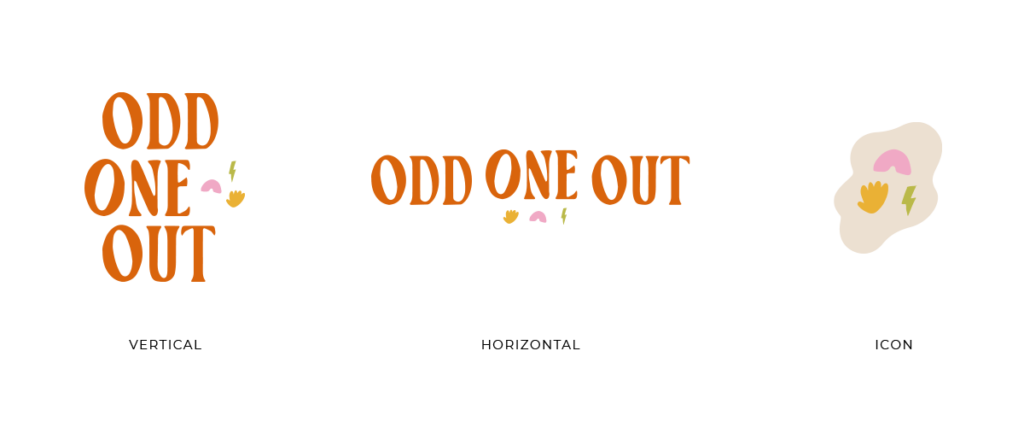
It’s great to have one amazing logo, but it won’t work everywhere. A good logo will be adaptable to different scenarios and have a few different colours and variations depending on:
- Is the format vertical or horizontal?
- Is the background light or dark?
- Is it displayed somewhere small like an app icon or on a billboard?
A good general rule is that you should have at least:
- A horizontal logo
- A vertical logo
- An icon
All of these should be available to you in multiple colours and file formats. Then you could also have a brand mark, which is a different logo variation in between a logo and an icon. You could have versions with or without your tagline… it really depends on the situation! I would strongly encourage you to work with a designer that will provide you with a solid logo suite.

Your Brand Fonts
Repeat after me, “I will not use the default font from the templates I’m using for my business”. Fonts are an important part of your brand identity and of what makes your business memorable. As much as possible, you should have clear fonts that you use in different scenarios and stick to them. Generally these are a font for large titles and headers, a font for regular paragraphs of text, and an accent font (like a handwritten scribble fun font). It’s important to stick to these and take the extra time to double check that your fonts work together!

Your Brand Colours
Colours are the fun part of branding right? I love looking at colour palettes and imagining all the different businesses that could be using them and what styles they would have… just me? Right. Colours clearly indicate to your target audience that it’s YOU. We all know what colours brands like Coca Cola, Primark or McDonalds use. Your colour palette should be detailed enough to provide you with multiple colour combinations, I usually have at least 5 colours in every palette I create. They should have a good blend of light and dark, and have some combinations that create contrast together. These can be expanded upon as the brand goes, maybe your podcast uses a specific colour combination and your youtube channel is slightly different… these all need to be tailored to your business.

Your Brand Images
If you want to take your brand identity to the next level, brand images are just the thing. I often get asked what’s missing for a brand to look premium and the answer is often photography. It will tie in everything together. Your brand images should give the same impression as your brand keywords and include some of your brand colours as well. People purchase from people so having your customers seeing real people using your brand and your product will have much more impact!
Your Brand Icons (if you have some)
Not every brand has this, but if you use icons in your brand messaging (Think for collections or maybe steps in your process). Your brand kit should include those icons in multiple file formats and colours.
Your Brand Guidelines
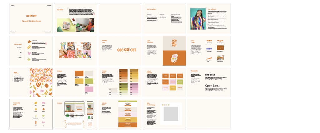
Your brand guidelines is the document that explains how to use your brand kit. How should the different logos be used? When to use each font? And what colour combinations are okay? It can outline examples as well! It’s important to note that if you want a strong brand, these guidelines are rules and not suggestions. They are generally provided to you by your designer and should be followed as closely as possible.
IMPORTANT: This can all evolve over time as needs arise.

So why is your brand kit important again?
Having a complete brand kit will make YOUR life as a business owner easier. You won’t need to constantly be creating new versions of everything or scrambling to convert your logo format into a PDF because the printer asked you to… It’s also great for saving money. Loads of brand designers (myself included) need a brand kit to be able to proceed with a website build. If you don’t have one it’s more work for me as I’m essentially creating all that for you and will need to charge you for it.
Regardless of all of that, having a strong brand identity isn’t all your need for your business to be successful, but it’s a great way to ensure your efforts are effective and falling into the right ears instead of throwing everything at the wall and seeing what sticks!